|
|
|
|
|

|
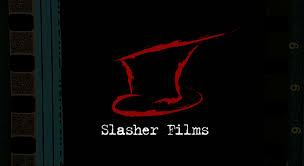
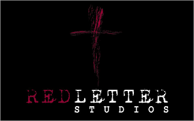
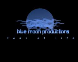
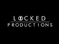
These are some examples of simple Horror Production Company logos. Even though they are fairly simple, they are effective as the colours of black, red and white tie in conventionally and stereotypically to the genre of horror. Therefore meaning that they will be recognisable to the genre of horror. The fact that they are simple is very effective towards the audience as they will most likely be able to recognise the logos if they were to come across them again, which benefits the production company and the audience.
These are a few designs created to demonstrate the range of ideas we had for the production company logo. Using inspiration from existing logos, the typical colours of a horror production company are repeated in some of our designs. For example, red and black are a theme constantly repeated throughout to show our understanding that a horror production company should have conventions which allows the audience to remember and relate the films created to the company, such as a colour scheme.
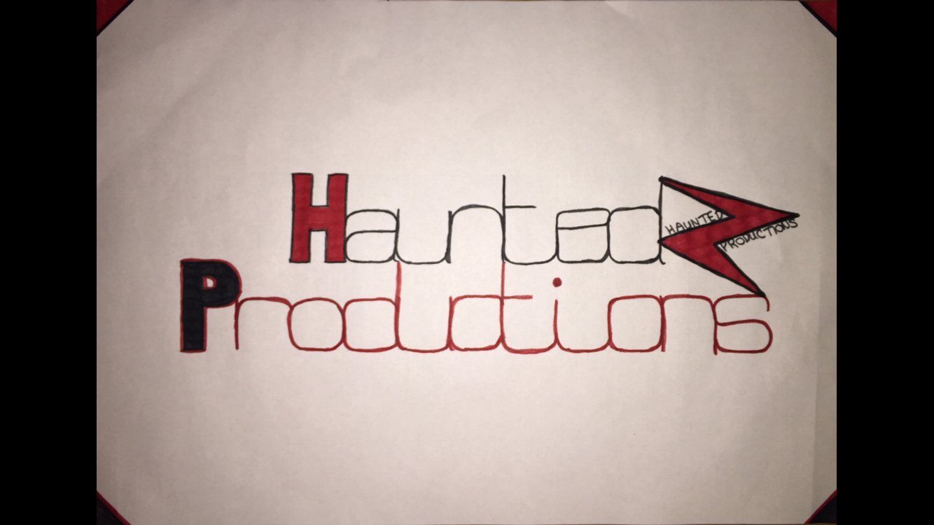
This is our final design of the horror production company logo. We decided to name it Haunted Productions because as a small independent production company, we wanted to have the name linked closely to the genre of horror films we may create, meaning that when mentioned, the audience will easily remember the relation to horror and the films, making the name of our production company common in their head. This will increase the audience size and promote the independent production company. In addition we created a smaller logo, on the top right, so that the viewers may be able to recognise this easier than the whole logo as it is simple and rememberable. Thus ensuring that the audience recall something to memorise the production company, even if it is a small image that sparks their interest.