|
.Dark Castle Entertainment:
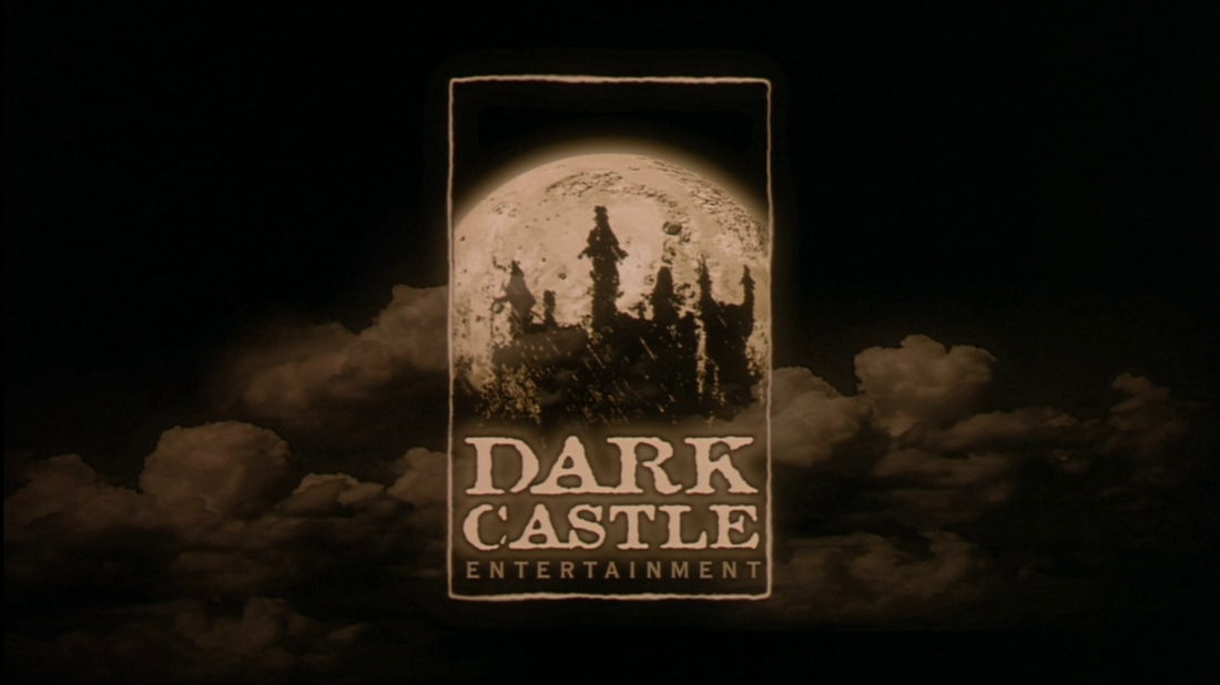
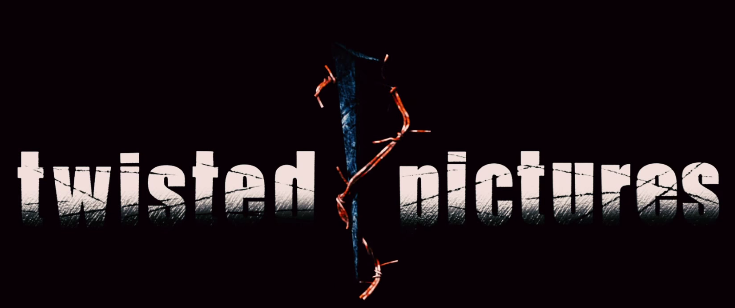
The logo for Dark Castle Entertainment is very spooky and creepy. There is a mysterious cloud misting over the background with adds a ghostly effect to the logo. It makes it recognisable as a horror company logo. The colours used are black and shades of brown which are very dark and deceiving. Also there is a moon looming behind the castle which is frightful and chilling. Ghost House Pictures: The image is of a ghostly skeleton which adds a mysterious and terrifying effect to it. The main colours are black and white which are very simple yet successful in shocking and scaring the audience. Twisted Pictures: This logo is very conventional for a horror company logo. The common colours are on this logo which are black, red and white. There is also a picture of a nail with thorns around it. This makes the logo look recognisable as a horror company logo because the image is very threatening and spooky which is a acknowledgement of horror. |
|
